
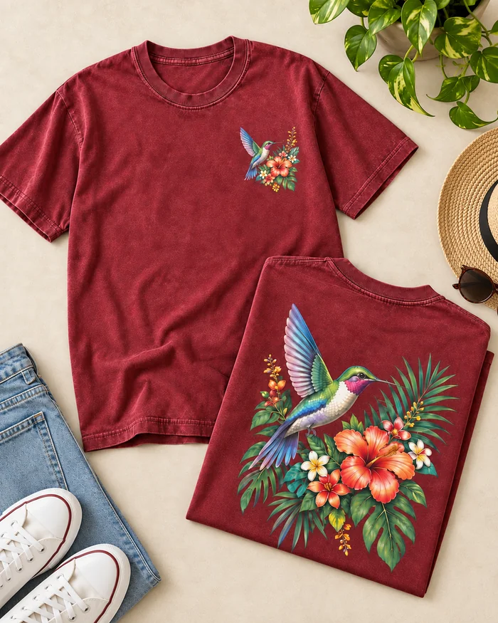
As a custom DTF printed T-shirt manufacturer, YX Custom Clothing works with fashion brands, streetwear labels and private label projects that need detailed, full-color graphics on T-shirts.
DTF is often a good option when the artwork is complicated — multiple colors, gradients, small lines, illustrated elements or a design that would need too many screens if produced by traditional screen printing.
But we do not choose DTF just because the artwork is colorful.
The garment, print size, fabric weight and final hand feel still need to make sense together. A small chest print and a large full-back transfer can use the same artwork style, but they are not really the same production problem.
When a buyer sends us a design, the first question is not always “Can this be printed with DTF?”
Usually the better question is: “What does this artwork actually need?”
Some graphics are simple enough for screen printing. Some need the color freedom of DTF. Others may work better with DTG or a combination of techniques.
DTF becomes useful when the design contains things like:
The hummingbird graphic used on this T-shirt is a good example.
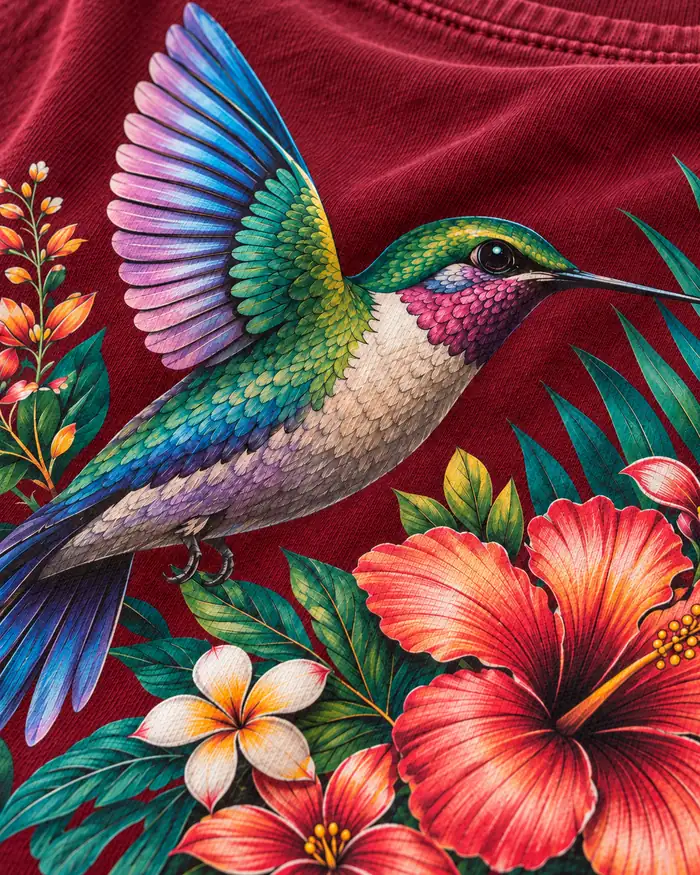
The wings, leaves, flowers and small color changes would be much more complicated to separate into multiple traditional screen-printing colors. DTF keeps those details in one transfer.
That is where the process has a real advantage.
This is something brands sometimes underestimate.
An artwork file may look perfectly clean on a laptop and still need adjustment before production.
Very thin lines can disappear. Small transparent areas may not behave as expected. Soft edges can become heavier once the white base is added.
With detailed illustration, we usually zoom into the problem areas instead of only looking at the full design.
On this graphic, for example, we would look closely at the hummingbird feathers, small flower petals, thin leaf edges and the narrow spaces between different elements.
If those areas survive the transfer cleanly, the rest of the print is usually much easier to control.
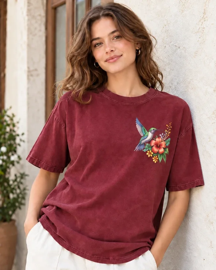
The T-shirt shown here is a washed burgundy color.
That matters.
Bright colors cannot simply be printed onto a dark garment and expected to look the same as they do on a white screen.
DTF normally uses a white layer behind the colored artwork. That white layer gives the colors enough support to stay visible on dark fabric.
If it is too weak, the design can look dull.
If it is unnecessarily heavy, the print can feel thicker than it needs to.
The balance is important, especially when the artwork contains bright red, green, blue and cream tones like this design.
We check the finished graphic on the actual garment color rather than judging color from the digital file alone.
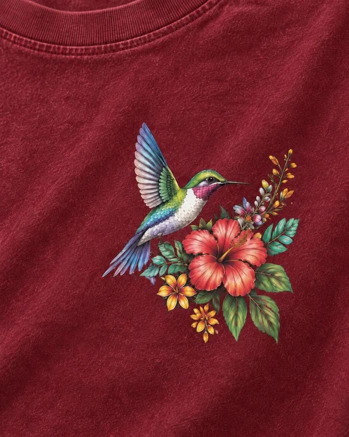
The small chest graphic on this T-shirt looks simple because it does not cover much fabric.
But small artwork can actually be less forgiving.
The bird, flowers and leaves are compressed into a relatively small area. That means fine lines and small gaps need to stay clean after printing and transfer.
If the file is reduced too aggressively, details start merging.
A chest design like this should still look clear from normal viewing distance, not just under a close-up camera.
The size also needs to sit naturally on the garment.
Too close to the neckline looks crowded. Too far toward the side can make the placement feel accidental.
This is why we prefer to check actual garment placement during sampling instead of relying only on coordinates in a tech pack.
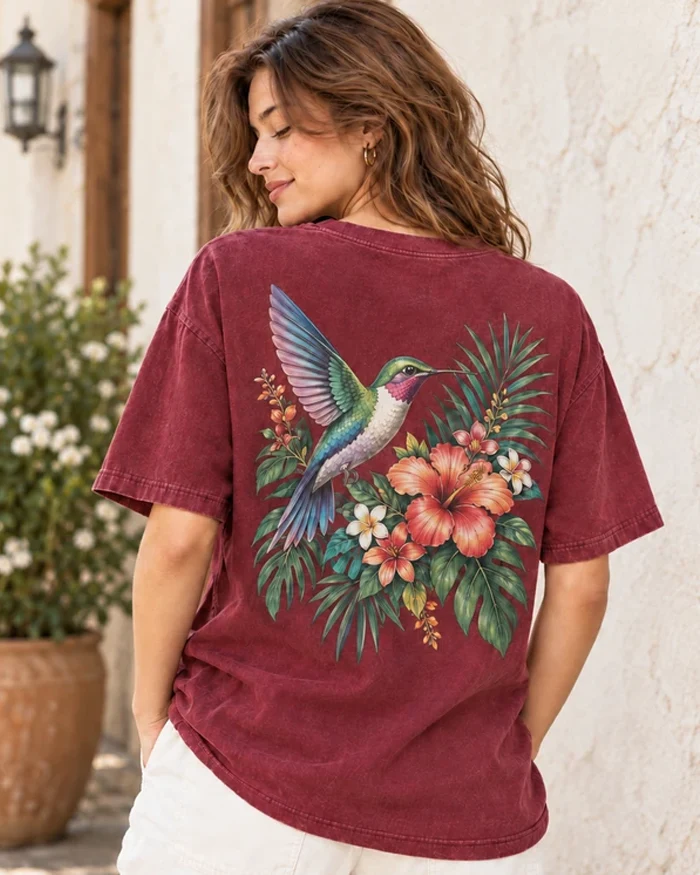
The back print creates a completely different impression.
Here, detail still matters, but print coverage and balance become much more important.
A large DTF transfer can look impressive, but if too much of the design is one continuous printed block, the garment may start to feel stiff.
The artwork on this page avoids that problem reasonably well because there are open spaces between the bird, flowers and leaves.
Those gaps allow some of the original fabric to remain exposed.
That helps the print feel less like one large plastic panel.
For large back designs, we pay attention to:
A design can be technically correct and still feel oversized once it is on a real body.
That is something a digital mockup does not always show well.
DTF sits on the surface of the fabric.
That is one of the reasons it can hold fine detail and strong color so well.
It also means you can feel the print.
For a small chest logo, this is usually not a major issue. For a large back graphic, it becomes much more noticeable.
This does not mean large DTF prints should be avoided.
It just means print coverage should be considered as part of the garment design.
A lightweight fashion T-shirt and a heavier streetwear T-shirt can handle the same graphic very differently.
We normally want the final transfer to feel appropriate for the fabric rather than simply making the artwork as large as possible.
This burgundy T-shirt has a washed surface.
The fabric already has variation before the print is added, which gives the garment a more worn-in appearance.
The DTF graphic stays much cleaner and brighter.
That contrast can look very good, especially for fashion and streetwear.
But it also means the garment finish and print cannot be developed separately.
A heavily washed T-shirt may react differently to heat than a standard untreated jersey.
Fabric weight, surface finish and garment color all matter.
For projects with garment washing, we prefer to confirm the actual finished fabric before locking the transfer setup.
The production step itself is only part of the job.
Once the transfer is pressed, we check what happened to the small details.
Did all thin elements transfer?
Are there any lifted edges?
Did the colors stay even?
Does the graphic feel consistent across the surface?
For detailed DTF artwork, small isolated parts usually show problems first.
A tiny leaf tip, thin flower stem or narrow section of a wing is often more useful for checking transfer quality than a large solid area.
If those small sections are clean, it is a good sign that the process is stable.
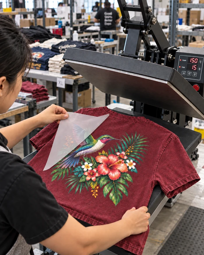
After pressing, the carrier film is removed according to the transfer system being used.
This is one of the easiest stages to underestimate.
A transfer can look fine before peeling and then reveal incomplete bonding once the film comes away.
Small graphic elements may lift.
Edges may not be fully attached.
Some areas may need to be checked again before the garment is accepted.
For this reason, the peel stage is not just a routine production step. It is also a quick visual quality check.
The production image on this page shows this part of the process because it is one of the points where problems become obvious very quickly.
With detailed DTF work, brands often care about color.
That is understandable, but screen color is only a reference.
The final appearance is influenced by the garment color, white base, print system, transfer film, heat and lighting.
A burgundy T-shirt will not present a graphic in exactly the same way as a white T-shirt.
During development, we are looking for a result that follows the approved visual direction consistently.
That is more useful than chasing a perfect screen-to-fabric match that may not be realistic.
A physical sample is especially important for DTF.
The artwork may look great digitally, but you still need to see:
This is also the point where the buyer can decide whether the chest print should be slightly larger, whether the back print needs to move up, or whether the artwork feels too heavy at full size.
These are much easier changes to make before bulk production.
Once the sample is approved, the challenge changes.
The question is no longer “Can we make this print?”
It becomes “Can we keep making it the same way?”
That means keeping control over placement, transfer quality, print appearance and garment condition throughout the order.
Our standard MOQ for custom DTF printed T-shirts is 100 pcs per color.
Depending on the project, production may include fabric sourcing, cutting, sewing, artwork preparation, DTF transfer production, heat pressing, print inspection, measurement, private labeling, folding and packaging.
We compare the bulk result against the approved sample rather than judging each garment only from the original digital artwork.
We use DTF when it fits the product.
That distinction matters.
If a design is one or two solid colors and the order is large, screen printing may be more practical.
If the design needs a raised surface, puff printing is a completely different option.
If the brand wants thread texture, embroidery makes more sense.
DTF becomes especially useful when the design needs color flexibility and fine detail without turning production into a complicated multi-screen setup.
The artwork, quantity, fabric and intended look should all be considered together.
Once the T-shirt and print direction are approved, private label details can be developed around the finished product.
This can include neck labels, care labels, hangtags and packaging.
We prefer to confirm the main garment first.
That way, label size, color and placement can be matched to the actual product instead of being developed separately from it.
Explore our custom T-shirt manufacturing options for other fabrics, fits and decoration methods.
DTF stands for direct-to-film printing. The artwork is printed onto transfer film and then applied to the garment using adhesive and heat. It is commonly used for detailed, full-color graphics.
Yes. It can work very well for small chest graphics and fine illustration, provided the artwork has enough resolution and the smallest details are suitable for production.
Yes. This is one of its main advantages. Gradients and multi-color graphics can be reproduced without preparing a separate screen for every color.
Yes. A white base is normally used underneath the colored artwork so that the design remains visible on dark or colored fabrics.
Yes. DTF creates a transfer layer on the surface of the fabric. The hand feel depends on print size, artwork coverage, transfer material and garment fabric.
Not necessarily. The result depends heavily on the artwork. Designs with open space between graphic elements usually feel less heavy than large solid blocks of print.
Yes, but simply scaling the same file is not always ideal. Small details and spacing may need adjustment for different print sizes.
Yes, but the garment finish and heat-transfer process should be tested together before bulk production.
Durability depends on transfer quality, pressing conditions, fabric and garment care. The bonding and finished surface should be checked during sampling before production.
Our standard MOQ is 100 pcs per color. Final requirements can also depend on fabric, print size, number of placements and other customization details.

Share your idea, sample request, or product details with us.